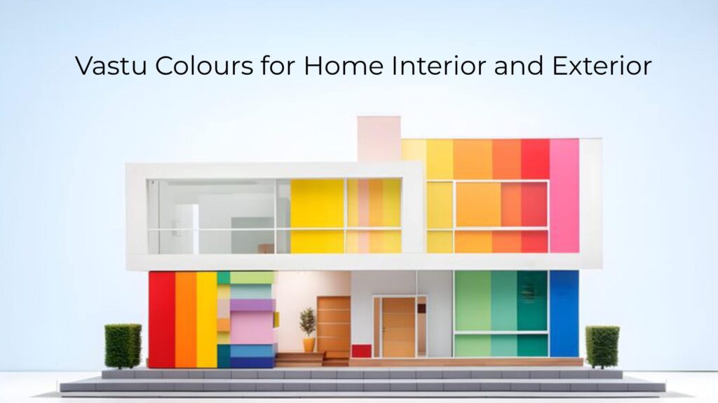
Colors possess extraordinary power to transform not just the aesthetics of your home but also the energy that flows through it. In Vastu Shastra, the ancient Indian science of architecture, colors represent far more than visual appeal, they embody vibrational frequencies that directly influence your health, prosperity, relationships, and overall well-being. Understanding how to select and apply Vastu colours for home interior and exterior creates living spaces that nurture, energize, and support every aspect of your life.
Whether you’re planning a new home in Bangalore, renovating your existing property, or simply looking to refresh your living environment, this comprehensive guide will help you harness the transformative power of colors according to timeless Vastu principles while meeting contemporary design standards.
Understanding the Science Behind Vastu Colours
Colors are not mere pigments, they are electromagnetic waves with specific frequencies that affect our physiology and psychology. Scientific studies demonstrate that colors can alter heart rate, blood pressure, mood, and even cognitive function. A blindfolded person exposed to red light experiences increased pulse rate, while blue light induces relaxation and decreased heart rate, proving that color’s impact transcends conscious visual perception.
Vastu Shastra recognizes this profound connection between colors and human experience, linking each hue to the five fundamental elements that constitute our universe: earth, water, fire, air, and space. When you align your home’s colors with these elemental energies and directional influences, you create environments that promote balance, harmony, and positive energy flow.
The Five Elements and Their Color Associations
Understanding how colors relate to Vastu’s five elements provides the foundation for making informed design decisions:
Earth Element: Represented by yellow, beige, brown, and earthy tones, the earth element provides stability, grounding, and material prosperity. These colors work beautifully in southwest zones and storage areas, creating feelings of security and abundance.
Water Element: Expressed through blue, aqua, sea green, and black, the water element governs flow, purification, and wealth. Water colors suit north and northeast zones, attracting financial prosperity and spiritual clarity when applied correctly.
Fire Element: Manifested in red, orange, pink, and saffron, the fire element represents energy, transformation, and vitality. Fire colors belong in southeast zones, stimulating appetite, passion, and dynamic action.
Air Element: Embodied in white, cream, and light gray, the air element facilitates movement, communication, and mental clarity. These colors excel in northwest zones and throughout homes requiring lightness and spaciousness.
Space Element: Represented by very light colors and white, the space element creates openness and allows other elements to coexist harmoniously. Space colors work universally but hold special importance in northeast zones and central areas.
Directional Color Guide for Home Interiors
Each direction in your home carries distinct energetic qualities governed by specific deities, elements, and planetary influences. Selecting colors that align with these directional energies enhances the natural benefits of each zone.
Northeast Direction: The Sacred Corner
The northeast, known as Ishanya Kon, represents the most spiritually charged zone in Vastu. This direction demands the lightest, purest colors to maintain its divine energy.
Best Colors: White, light blue, pale yellow, light green, cream
Application: These colors work perfectly for prayer rooms, meditation spaces, and any northeast-facing walls. Light blue promotes spiritual awareness and mental clarity, while white enhances purity and divine connection.
Avoid: Red, orange, dark colors, or heavy shades that introduce fire energy and heaviness to this sacred water and space element zone.
East Direction: The Zone of New Beginnings
Governed by the sun and associated with health, vitality, and social growth, the east direction benefits from fresh, light colors that welcome morning energy.
Best Colors: White, light blue, light green, beige, off-white
Application: East-facing walls, living rooms, children’s bedrooms, and social spaces thrive with these colors. Light green expands social connections and supports career growth, while white brings freshness and new opportunities.
Avoid: Black, dark gray, or any color that blocks the light and vitality this direction naturally provides.
Southeast Direction: The Fire Corner
The southeast zone, governed by Agni (fire deity), naturally aligns with fire element energy and requires colors that enhance this quality without overwhelming it.
Best Colors: Orange, red, pink, silver, white, light gray
Application: Kitchens positioned in the southeast benefit enormously from these warm, energizing colors. Light pink offers fire energy with softness, while orange stimulates appetite and enthusiasm. For walls, prefer softer tones like peach or coral rather than intense red.
Avoid: Blue, black, and water element colors that create elemental conflict in this fire zone.
South Direction: The Zone of Fame and Recognition
The south direction, associated with fire element and governed by Yama (deity of dharma), supports authority, reputation, and achievement.
Best Colors: Red (in lighter shades), pink, coral, orange, warm yellow
Application: Use these warm, vibrant colors for south-facing walls, accent walls, or decorative elements. Light red or pink enhances confidence and provides power, while warm yellow supports recognition and success.
Avoid: Excessive dark blue or black that can dampen the fire energy essential for this direction’s benefits.
Southwest Direction: The Foundation of Stability
The southwest, governed by earth element, provides grounding, relationship harmony, and material security when properly balanced.
Best Colors: Yellow, beige, brown, peach, cream, light brown, earthy tones
Application: Master bedrooms in the southwest excel with yellow-beige combinations that promote stability and harmonious relationships. Earthy brown tones enhance grounding, while peach adds warmth and contentment.
Avoid: Excessive blue or green that introduces too much movement to this stability-oriented zone.
West Direction: The Zone of Prosperity
Associated with water element and governed by Varuna (water deity), the west direction influences gains, profits, and social connections.
Best Colors: Blue, white, cream, light gray, silver
Application: West-facing walls benefit from these cool, calming colors. Blue enhances the water element’s flow and attracts material gains, while white creates spaciousness and purity.
Avoid: Excessive red or orange that creates elemental conflict with the water energy of this zone.
Northwest Direction: The Air Zone
Governed by air element, the northwest facilitates movement, communication, change, and social relationships.
Best Colors: White, cream, light gray, light yellow
Application: Guest rooms, offices requiring frequent travel, and communication spaces benefit from these light, airy colors. White promotes clarity and openness, while cream adds subtle warmth to northwest zones.
Avoid: Heavy, dark colors that restrict the movement and flow this direction naturally supports.
North Direction: The Wealth Magnet
The north direction, governed by Kubera (deity of wealth) and associated with water element, attracts prosperity and career opportunities.
Best Colors: Green, blue, light blue, pista green, white
Application: Green in north zones dramatically enhances financial growth and career advancement. Blue supports the water element, while white maintains lightness essential for wealth flow.
Avoid: Red, orange, or excessive fire colors that conflict with this water-dominant wealth zone.
Room-by-Room Vastu Colour Guide for Interiors
Living Room Colours as Per Vastu
As the social heart of your home, the living room requires colors that promote warmth, welcome guests, and facilitate harmonious family interactions.
Best Colors: White, beige, cream, light yellow, soft green, light blue
Why They Work: These colors create inviting, spacious atmospheres perfect for gatherings. White and beige work universally across all directions, while yellow adds cheerfulness. Light green promotes growth and harmony, making conversations flow smoothly.
Application Tips: Use neutral base colors like white or cream for walls, adding pops of green, yellow, or blue through furnishings, artwork, and accessories. This approach maintains Vastu compliance while allowing personal style expression.
Bedroom Colours as Per Vastu
Bedrooms require colors that promote restful sleep, emotional balance, and relationship harmony.
Master Bedroom (Southwest): Blue, indigo, or earthy tones like beige and brown. Blue promotes deep sleep and tranquility, while earthy colors provide stability and grounding essential for master bedrooms. Newly married couples can incorporate soft pink or rose for romance and bonding.
Children’s Bedroom (North, East, Northwest): Light green, light blue, light yellow, lavender, or soft orange. These colors support growth, learning, creativity, and peaceful sleep for young family members.
Guest Bedroom: Pink, yellow, sky blue, or orange create welcoming, comfortable atmospheres for visitors while maintaining positive energy.
Colors to Avoid: Intense red, black, or very dark colors can create agitation, disturb sleep, or introduce negative energy into rest spaces.
Kitchen Colours as Per Vastu
The kitchen’s association with fire element and nourishment makes color selection particularly important for health and prosperity.
Best Colors: Orange, red (in moderation), yellow, pink, white, cream, rose, light chocolate
Why They Work: Warm colors stimulate appetite, enhance digestion, and create energizing cooking environments. Orange channels fire energy perfectly, yellow promotes cheerfulness during meal preparation, and pink adds warmth without overwhelming intensity.
Application Tips: Use warm colors like orange or yellow as accents rather than painting entire kitchens in intense fire colors. White or cream cabinets with orange/yellow accent walls create balanced, Vastu-compliant kitchens.
Bathroom Colours as Per Vastu
Bathrooms require colors that promote cleanliness, purification, and waste elimination.
Best Colors: White, light blue, light green, light pink, light yellow, aqua, sea green
Why They Work: Light colors maintain the hygiene and freshness essential for bathrooms. Light blue and aqua enhance the water element, promoting proper flow and waste elimination. White represents purity and cleanliness.
Avoid: Black, dark gray, or very dark colors that can make bathrooms feel oppressive or retain negative energy.
Prayer Room Colours as Per Vastu
The prayer or pooja room demands colors that enhance spirituality, meditation, and divine connection.
Best Colors: White, light yellow, light blue, cream, light pink, light green
Why They Work: White represents purity and divine connection. Light yellow enhances concentration and wisdom. Light blue promotes calmness and spiritual awareness. These colors create serene environments conducive to prayer and meditation.
Avoid: Red, orange, black, or any intense colors that disturb the peaceful, contemplative energy essential for spiritual practices.
Study Room Colours as Per Vastu
Study rooms and home offices require colors that enhance concentration, productivity, and mental clarity.
Best Colors: Green, light blue, white, cream, light purple, lavender
Why They Work: Green enhances focus, reduces eye strain, and supports continuous learning. Light blue promotes calmness and clear thinking. White creates spaciousness and mental clarity essential for intellectual work.
Avoid: Intense red or orange that can create restlessness, or dark colors that promote drowsiness and reduce concentration.
Dining Room Colours as Per Vastu
Dining areas benefit from colors that stimulate appetite, promote family bonding, and create warm atmospheres.
Best Colors: Light green, pink, orange, yellow, cream, off-white
Why They Work: Warm, gentle colors create inviting dining environments. Light green aids digestion, yellow promotes happiness during meals, and pink enhances family bonding and pleasant conversation.
Avoid: Dark blue, black, or cold colors that suppress appetite or create uncomfortable dining experiences.
Vastu Colours for Home Exterior: Creating the Perfect First Impression
Your home’s exterior serves as the first impression for visitors and the primary gateway through which energy enters your property. Selecting appropriate colors for external walls, main doors, and architectural features according to Vastu principles attracts prosperity, positive vibrations, and auspicious energy.
Best Exterior Wall Colours as Per Vastu
Universal Auspicious Colors: Light yellow, cream, off-white, beige, light orange, light peach, white
Why They Work: Light, warm colors reflect heat (particularly important in India’s climate), make homes appear inviting and spacious, and attract positive energy. These colors suit all zodiac signs and family compositions, making them universally beneficial choices.
Direction-Specific Exterior Colors:
North-Facing Homes: Light green, white, cream, or blue exterior walls enhance wealth attraction and career growth associated with north direction.
East-Facing Homes: White, cream, light yellow, or light orange promote health, vitality, and new opportunities aligned with east energy.
South-Facing Homes: Light red, pink, coral, or warm yellow (in lighter shades) support fame, recognition, and authority associated with south direction without overwhelming intensity.
West-Facing Homes: White, cream, light blue, or light gray maintain balance and attract material gains aligned with west direction.
Main Door and Gate Colours as Per Vastu
The main entrance represents the primary energy gateway, making its color selection crucial for positive energy flow.
Best Main Door Colors: Brown (wood tones), green, yellow, blue, white
Brown/Wood Tones: Natural wood colors or brown represent stability, earthiness, and welcome. These colors work well for all directions and create warm, inviting entrances.
Green: Promotes growth, prosperity, and fresh energy. Particularly auspicious for north and east-facing main doors.
Yellow/Golden: Attracts wealth, wisdom, and positive vibrations. Works excellently for northeast, east, and north entrances.
Blue: Represents peace, calmness, and protection. Suitable for north, west, and northwest-facing doors.
Colors to Avoid: Black, very dark gray, or intense red for main doors, as these can block positive energy entry or create excessive intensity at your home’s primary energy gateway.
Exterior Trim, Windows, and Architectural Features
Window Frames: White, cream, or colors matching your overall exterior scheme maintain visual harmony and energy balance.
Roof Colors: Terracotta, earthy brown, green, or traditional red tiles align with Vastu when your overall design balances these elements appropriately.
Balcony and Terrace Colors: Light blue, white, beige, light green, or soft pink create relaxing outdoor spaces perfect for meditation and leisure.
Colors to Avoid in Vastu
Certain colors carry energies that can disrupt your home’s balance when used excessively or inappropriately:
Black: Absorbs positive energy, creates heaviness, and can promote depression or negative emotions. Use sparingly only as small accents, never as dominant colors in any room or exterior walls.
Very Dark Colors: Deep gray, charcoal, navy blue (in large quantities), or dark brown create oppressive environments and block natural energy flow. Reserve these for minimal accent use only.
Excessive Red: While appropriate in moderation for southeast zones, excessive red throughout homes creates agitation, aggression, and restlessness. Use red thoughtfully as accents rather than dominant colors.
Deep Purple in Excess: Can create melancholy or overly introspective environments when used extensively. Light lavender works well, but avoid deep, dark purple as dominant colors.
Practical Tips for Implementing Vastu Colours
Test Before Committing
Always test paint colors in your actual space before final application. Colors appear dramatically different under various lighting conditions. Paint large swatches on walls and observe them throughout different times of day, morning sunlight, afternoon brightness, evening artificial light, before making final decisions.
Balancing Personal Preference with Vastu
Vastu provides guidelines, not rigid commandments. You can absolutely express personal style while respecting Vastu principles. If you love a particular color that doesn’t perfectly align with Vastu recommendations for a zone, use it as an accent through furnishings, artwork, or one feature wall rather than painting entire rooms.
Using Two-Tone and Accent Walls
Create visual interest while maintaining Vastu compliance by using lighter Vastu-approved base colors with carefully selected accent walls in complementary hues. This approach allows color expression without overwhelming spaces with potentially challenging colors.
Remedies for Existing Non-Vastu Colors
If your home already features colors that don’t align with Vastu principles, you can implement remedies without complete repainting:
- Add opposite element corrections through decor, artwork, or accessories
- Use heavy curtains or drapes in Vastu-approved colors to balance wall colors
- Introduce plants, crystals, or symbolic Vastu items to neutralize challenging color energies
- Focus on getting one or two important rooms (bedroom, kitchen) correct before addressing entire home
Choosing Vastushilpa for Your Vastu-Compliant Color Design in Bangalore
With over 25 years of specialized experience in Vastu-based construction and interior design throughout Bangalore, Vastushilpa brings unmatched expertise to your color selection and overall design project. Our comprehensive approach considers not just directional color recommendations but also your personal preferences, architectural style, natural lighting conditions, and contemporary design trends.
We believe exceptional interiors emerge from thoughtful integration of Vastu wisdom with modern aesthetics, ensuring your home is not only energetically balanced but also beautifully designed and personally meaningful. Our services include complete color consultation, Vastu analysis, interior design, exterior design, and turnkey implementation of your vision.
Conclusion: Transform Your Home Through the Power of Color
Vastu colours for home interior and exterior represent powerful tools for creating environments that actively support your health, prosperity, relationships, and overall well-being. By understanding the elemental associations, directional influences, and psychological impacts of different colors, you can make informed decisions that transform your house into a harmonious home filled with positive energy.
Whether you’re planning a new construction project, renovating your existing Bangalore home, or simply seeking to refresh your living spaces, applying Vastu color principles creates meaningful improvements that you’ll experience daily. The key lies in balancing traditional wisdom with contemporary aesthetics, creating spaces that honor ancient principles while reflecting your unique personality and lifestyle.
Ready to transform your home with Vastu-compliant colors? Contact Vastushilpa today for expert consultation on creating beautifully designed, energetically balanced living spaces that support your dreams and enhance your family’s well-being.
Frequently Asked Questions
Light, warm colors like white, cream, beige, light yellow, light green, and light blue are universally auspicious for home interiors. These colors promote positive energy, make spaces feel larger and brighter, and suit various directions and room functions.
Light yellow, cream, off-white, beige, and light peach are the most recommended exterior colors. These shades attract positive energy, reflect heat (important in India’s climate), and create welcoming first impressions while suiting all family compositions.
Dark colors should be minimized or avoided in Vastu-compliant homes. Colors like black, very dark gray, and deep blue absorb positive energy and create heaviness. If you love darker colors, use them sparingly as small accents rather than dominant wall colors.
Brown (natural wood tones), green, yellow, blue, or white work excellently for main doors. Avoid black or very dark colors for main doors as they can block positive energy entry to your home.
Yes, each direction has specific color associations based on its governing element and deity. For example, north benefits from green and blue (wealth), east from white and light green (health), southeast from orange and pink (fire energy), and southwest from yellow and brown (stability).
Avoid intense red, black, very dark colors, or excessively bright colors in bedrooms. These can create agitation, disturb sleep, or introduce restless energy. Prefer calming colors like light blue, soft green, lavender, or neutral beiges.
Absolutely! Start with one or two important rooms like your bedroom or kitchen. You can also introduce Vastu colors through curtains, furnishings, artwork, and accessories rather than repainting walls if complete renovation isn’t feasible.
Consider the room’s direction, primary function, natural lighting, and your personal preferences. Test paint samples in your actual space at different times of day. Select colors that feel right to you while staying within Vastu-approved options for that zone
Yes, white and cream are universally auspicious neutral colors in Vastu. They work well in all directions and rooms, creating light, spacious, and pure environments. You can use them throughout your home as base colors.