The kitchen is not just a functional space; it is the heart of every home where nourishment, energy, and emotions come together. In Indian households, the kitchen plays a central role in daily life, influencing health, relationships, and overall well-being. This is why choosing the right kitchen colours as per Vastu Shastra becomes extremely important.
Vastu Shastra, the ancient science of architecture, emphasizes how colours affect energy flow within a space. The right kitchen colours can enhance positivity, improve mood, and promote prosperity, while incorrect choices may create imbalance and discomfort. When thoughtfully selected, colours can transform your kitchen into a vibrant, harmonious, and energetically balanced environment.
In this detailed guide, we will explore how to choose the best kitchen colour according to Vastu Shastra, helping you create a space that supports health, happiness, and positive energy.
Understanding the Role of Colours in Vastu Shastra
Colours in Vastu Shastra are powerful elements that influence energy flow, emotions, and spatial harmony within a home. In the kitchen, which represents the fire element, selecting appropriate colours helps maintain balance, enhances positivity, and supports a peaceful, nourishing environment for daily cooking activities.
How Colours Influence Energy in the Kitchen:
Let’s explore how colours shape the kitchen’s atmosphere and energy flow:
- Enhance emotional well-being: Warm shades like yellow and peach uplift mood and reduce stress.
- Affect appetite and mood: Colours like orange and yellow stimulate appetite and create a lively environment.
- Control energy flow: Light colours reflect energy and keep the space active, while dark colours may create heaviness.
- Improve cleanliness perception: White and cream shades make the kitchen appear cleaner and more spacious.
- Align with natural elements: Colours help balance fire, water, and earth elements in the kitchen.
Why Kitchen Colour Selection Matters in Vastu
Kitchen colour selection plays a vital role in maintaining harmony and balance within the home environment. According to Vastu Shastra, the right colours positively influence health, emotions, and relationships, while incorrect choices may disrupt energy flow and create discomfort in daily cooking and family interactions.
How Kitchen Colours Impact Daily Life:
Let’s understand how kitchen colours influence everyday living:
- Supports physical health: A balanced environment encourages better eating habits and digestion.
- Enhances mental peace: Soft and soothing colours reduce stress while cooking.
- Improves family bonding: A positive kitchen environment encourages interaction and togetherness.
- Boosts productivity: Bright and well-balanced colours increase motivation in cooking.
- Attracts prosperity: Harmonious colours help invite positive energy and abundance.
How to Choose Kitchen Colours as per Vastu Shastra
Each colour in Vastu Shastra carries a specific energy and symbolic meaning that affects the kitchen’s environment. Choosing colours thoughtfully helps enhance positivity, balance natural elements, and create a space that feels vibrant, welcoming, and supportive of both physical health and emotional well-being.
How Different Colours Affect Kitchen Energy:
Let’s explore how each colour contributes to kitchen energy:
- Yellow for positivity and happiness: Brings warmth, joy, and uplifting energy.
- White for purity and cleanliness: Creates a calm, clean, and spacious feel.
- Green for freshness and balance: Promotes healing, growth, and a natural vibe.
- Orange for energy and appetite: Adds vibrancy and encourages social interaction.
- Brown for stability and grounding: Provides warmth and a sense of security.
- Peach for warmth and comfort: Creates a soft, welcoming, and cozy atmosphere.
Core Principles of Choosing Kitchen Colours as per Vastu
Understanding the core principles of Vastu Shastra is essential before selecting kitchen colours. These guidelines ensure that the chosen shades support the fire element, maintain energy balance, and create a harmonious environment that enhances both functionality and emotional comfort within the kitchen space.
How to Choose Colours Based on Vastu Principles:
Let’s explore the essential guidelines for selecting kitchen colours:
- Balance the fire element: Use colours that support or calm fire energy without overpowering it.
- Prefer light and natural shades: These enhance positivity and openness in the space.
- Avoid excessive dark tones: Dark colours can create heaviness and energy imbalance.
- Use colour combinations wisely: Harmonious combinations improve both energy and aesthetics.
- Consider kitchen direction: Direction plays a key role in choosing suitable colours.
Importance of Kitchen Direction in Colour Selection
The direction of the kitchen plays a crucial role in Vastu Shastra, as it determines how energy flows within the space. Selecting colours based on direction helps balance elements, enhance positivity, and ensure that the kitchen supports health, prosperity, and overall well-being effectively.
How Kitchen Direction Influences Colour Choices:
Let’s explore how different directions affect colour selection:
- East-facing kitchen: Light yellow, white, and green enhance sunlight and positivity.
- South-facing kitchen: Orange, pink, and light red can balance strong fire energy.
- West-facing kitchen: Neutral shades like white, cream, and light grey maintain stability.
- North-facing kitchen: Green, light blue, and soft yellow support growth and freshness.
Best Kitchen Colours as per Vastu Shastra for Positive Energy
Choosing the right colours for your kitchen plays a vital role in creating a balanced and harmonious environment. According to Vastu Shastra, colours influence mood, energy flow, and overall well-being, making it essential to select shades that support positivity, health, and prosperity.
Yellow – The Colour of Positivity and Warmth
Yellow is one of the most recommended kitchen colours as per Vastu Shastra, as it represents sunlight, happiness, and positive energy. It creates a vibrant, uplifting environment, enhances mood, improves brightness, stimulates appetite, and brings warmth, making the kitchen feel lively, welcoming, and energetically balanced.
How Yellow Enhances Kitchen Energy:
- Boosts positivity and mood: Yellow creates a cheerful environment that uplifts emotions, reduces stress, improves mental clarity, enhances daily cooking experience, and promotes a lively welcoming atmosphere within the kitchen space.
- Stimulates appetite naturally: Yellow enhances appetite and digestion by creating a warm and inviting environment, making meals more enjoyable and encouraging healthy eating habits for all family members daily.
- Improves brightness and openness: Yellow reflects natural and artificial light effectively, making the kitchen appear brighter, larger, more spacious, and visually open, especially beneficial for compact or enclosed kitchen layouts.
- Ideal for walls and accents: Yellow works best for walls, backsplashes, and accent elements, adding warmth and vibrancy while maintaining balance without overpowering the kitchen’s overall design aesthetics.
White – The Colour of Purity and Cleanliness
White is a timeless and highly recommended kitchen colour as per Vastu Shastra, symbolizing purity, clarity, and peace. It enhances cleanliness, reflects light efficiently, creates a spacious feel, supports a calm atmosphere, and balances stronger colours, making the kitchen look modern, hygienic, and energetically positive.
How White Balances Kitchen Energy:
- Enhances cleanliness perception: White makes the kitchen look clean, hygienic, organized, and well-maintained, which is essential for food preparation spaces and supports a healthy cooking environment daily.
- Reflects maximum light: White reflects both natural and artificial light effectively, making the kitchen brighter, more open, airy, and comfortable for everyday cooking and dining activities.
- Creates visual spaciousness: White visually expands small kitchens, making them appear larger, less cluttered, more open, and spacious, ideal for apartments or compact kitchen designs.
- Works as a base colour: White acts as a perfect base colour that pairs well with all Vastu-approved shades, allowing flexible combinations and easy integration into modern kitchen design styles.
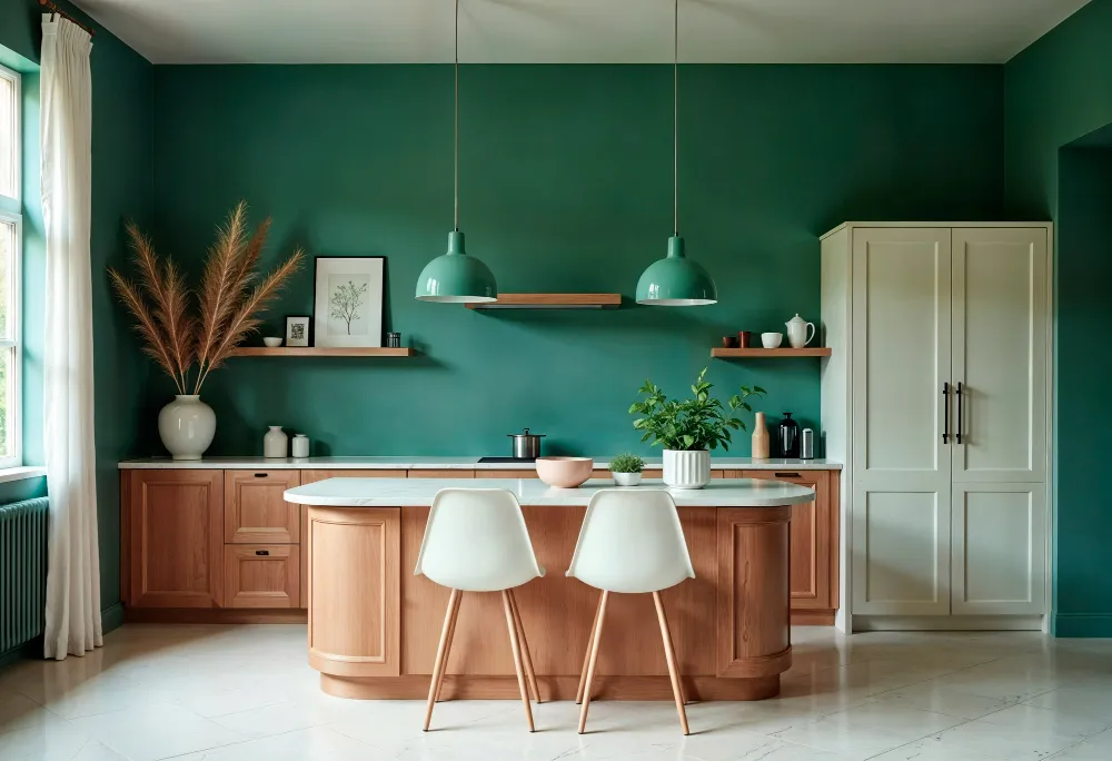
Green – The Colour of Freshness and Balance
Green is a refreshing and healing colour in Vastu Shastra, representing nature, growth, and harmony. It brings freshness into the kitchen, balances fire energy, promotes healthy living, reduces stress, and creates a calm and soothing environment, making it ideal for a peaceful and balanced cooking space.
How Green Supports Kitchen Harmony:
- Promotes freshness and calmness: Green creates a soothing environment that reduces stress, improves relaxation, enhances comfort, and makes cooking a peaceful and enjoyable experience for everyday kitchen use.
- Encourages healthy lifestyle: Green subconsciously connects with nature, promoting healthy eating habits, balanced nutrition, and a refreshing environment that supports physical and mental well-being for the family.
- Balances fire element energy: Green acts as a cooling colour that balances the fire element in the kitchen, preventing excessive heat energy and maintaining harmony according to Vastu principles.
- Perfect for cabinets and accents: Green works well for cabinets, tiles, backsplashes, and decorative elements, adding freshness, natural appeal, and visual balance without overwhelming the kitchen design.
Peach – The Colour of Comfort and Warmth
Peach is a soft and nurturing colour recommended in Vastu Shastra for creating warmth and emotional balance. It brings comfort, reduces tension, enhances visual softness, and creates a welcoming kitchen atmosphere, making it perfect for family spaces that require harmony, care, and a calm cooking environment.
How Peach Enhances Kitchen Ambience:
- Creates a welcoming atmosphere: Peach creates a warm and inviting kitchen environment that makes family members and guests feel comfortable, relaxed, and emotionally connected during cooking and dining activities.
- Balances emotional energy: Peach helps reduce stress, tension, and emotional imbalance, promoting calmness, harmony, and peaceful interactions within the kitchen and family environment.
- Adds softness to design: Peach tones soften the kitchen’s visual appeal, making the space look elegant, balanced, and aesthetically pleasing without being too bright or overpowering.
- Suitable for walls and tiles: Peach works best for walls, tiles, and backsplashes, especially when combined with neutral shades like white or beige for a balanced design.
Light Brown – The Colour of Stability and Grounding
Light brown is associated with the earth element in Vastu Shastra, symbolizing stability, strength, and grounding energy. It creates a warm and natural kitchen environment, enhances comfort, supports long-term usability, and connects with nature, making it ideal for creating a stable and balanced cooking space.
How Light Brown Creates Stability:
- Provides grounding energy: Light brown creates a stable and secure environment in the kitchen, offering comfort, emotional balance, and a sense of reliability for everyday activities.
- Enhances natural aesthetics: Light brown complements wooden finishes, natural materials, and earthy textures, creating a warm, organic, and visually appealing kitchen design.
- Supports long-term comfort: Brown tones provide a relaxing environment that ensures long-term usability, comfort, and consistency in the kitchen’s overall atmosphere and functionality.
- Ideal for cabinets and flooring: Light brown is best suited for cabinets, flooring, countertops, and wooden finishes, creating a grounded and natural kitchen environment.
Orange – The Colour of Energy and Enthusiasm
Orange is a vibrant and energetic colour in Vastu Shastra that represents warmth, enthusiasm, and activity. It stimulates appetite, encourages interaction, and enhances cooking energy. When used thoughtfully, it adds brightness and liveliness, making the kitchen more dynamic, engaging, and energetically balanced.
How Orange Boosts Kitchen Vibrancy:
- Stimulates appetite and interaction: Orange enhances appetite, encourages lively conversations, promotes social interaction, and creates an energetic atmosphere, making the kitchen more engaging and enjoyable for family gatherings and meals.
- Enhances cooking enthusiasm: Orange boosts creativity, motivation, and enthusiasm during cooking activities, helping individuals feel more energetic, inspired, and productive while preparing meals in the kitchen space.
- Adds warmth and brightness: Orange introduces warmth and brightness into the kitchen, making the space feel vibrant, lively, visually appealing, and full of positive energy without feeling dull or inactive.
- Best for accent usage: Orange should be used in accents like tiles, decor, or accessories to maintain balance, preventing the kitchen from becoming overly intense or visually overwhelming.
Cream – The Colour of Simplicity and Elegance
Cream is a soft and elegant neutral colour in Vastu Shastra that represents simplicity, warmth, and balance. It creates a calm and soothing kitchen environment, enhances light reflection, and supports versatile design combinations, making it suitable for both modern and traditional kitchen interiors.
How Cream Maintains Harmony:
- Creates a calm environment: Cream tones create a peaceful and soothing kitchen environment that reduces stress, enhances relaxation, and supports comfortable daily cooking and dining experiences.
- Enhances light reflection: Cream reflects natural and artificial light effectively, making the kitchen brighter, more open, visually spacious, and comfortable for everyday use.
- Supports versatile design combinations: Cream pairs well with various colours, materials, and finishes, allowing flexible design options while maintaining harmony and balance in the kitchen space.
- Ideal for walls and cabinets: Cream works best for walls, cabinets, ceilings, and larger surfaces, creating a clean, elegant, and timeless kitchen appearance.
Pink – The Colour of Warmth and Positivity
Pink is a gentle and comforting colour in Vastu Shastra that promotes emotional balance, warmth, and positivity. It softens the kitchen environment, enhances relationships, and creates a welcoming atmosphere, making it ideal for family kitchens that focus on comfort, harmony, and peaceful interactions.
How Pink Enhances Kitchen Feel:
- Encourages positive interactions: Pink promotes calm communication, emotional balance, and harmonious interactions among family members, making the kitchen a comfortable and welcoming space for shared moments.
- Softens overall design: Pink tones reduce harshness in kitchen interiors, adding softness, elegance, and visual warmth without overwhelming the overall design or aesthetic balance.
- Improves visual brightness: Light pink shades enhance brightness, making the kitchen feel more open, airy, inviting, and visually appealing for daily use.
- Best for subtle accents: Pink works best for walls, tiles, backsplashes, or decorative accents, ensuring the colour remains balanced and not overpowering.
Beige – The Colour of Neutral Balance
Beige is a neutral and versatile colour in Vastu Shastra that represents calmness, simplicity, and balance. It creates a peaceful kitchen environment, enhances spaciousness, complements natural materials, and supports modern aesthetics, making it ideal for maintaining harmony and visual comfort.
How Beige Supports Kitchen Balance:
- Creates a peaceful environment: Beige tones reduce visual clutter, create calmness, and maintain a balanced atmosphere, making the kitchen feel comfortable, organized, and stress-free for everyday use.
- Enhances spacious appearance: Beige helps small kitchens appear larger, more open, and less congested by reflecting light and maintaining a neutral visual tone.
- Pairs with natural materials: Beige complements wood, stone, and metal finishes beautifully, creating a cohesive, natural, and aesthetically pleasing kitchen design.
- Ideal for flooring and walls: Beige is perfect for flooring, walls, and cabinets, providing a neutral base that supports various design styles and colour combinations.
Metallic Accents – The Element of Modern Balance
Metallic accents are used in Vastu Shastra to balance elements and enhance energy flow within the kitchen. They reflect light, add modern appeal, support visual contrast, and improve brightness, making them ideal for subtle design elements without disturbing the overall harmony.
How Metallic Elements Enhance Energy:
- Reflect light and energy: Metallic surfaces reflect light effectively, improving brightness, enhancing energy flow, and making the kitchen feel more vibrant, open, and visually appealing.
- Add modern appeal: Metallic finishes add a contemporary touch to kitchen design while maintaining balance and harmony according to Vastu principles.
- Balance design elements: Metallic accents help harmonize different materials, textures, and colours, ensuring a cohesive and balanced kitchen environment.
- Best for fixtures and hardware: Metallic elements work best in handles, faucets, lighting fixtures, and small details, adding style without overwhelming the overall design.
Kitchen Layout Colours as per Vastu Shastra
Choosing the right kitchen colour is not limited to walls alone. According to kitchen colours as per Vastu Shastra, every element of the kitchen—platform, cabinets, flooring, and tiles—plays a crucial role in maintaining energy balance.
A well-designed kitchen combines colours thoughtfully across all surfaces to create harmony between the fire element and other natural elements. When each component follows Vastu guidelines, the kitchen becomes more functional, visually appealing, and energetically balanced.
Kitchen Platform Colour as per Vastu Shastra
The kitchen platform is one of the most used areas and directly connected to cooking activities. Its colour should support cleanliness, balance, and positive energy flow.
How to Choose Kitchen Platform Colour:
- Use light and neutral shades: Light colours like white, beige, or light grey help maintain cleanliness, reflect light effectively, and create a hygienic cooking surface that supports positive energy.
- Avoid dark platform colours: Dark shades such as black or deep grey absorb energy, make the space look heavy, and may disturb the balance of the fire element.
- Choose natural stone tones: Natural shades like light brown or soft green create a connection with earth elements and enhance stability in the kitchen environment.
- Maintain smooth and clean surfaces: A clean and clutter-free platform ensures smooth energy flow and supports hygiene and functionality in daily cooking activities.
Kitchen Cabinet Colour as per Vastu Shastra
Cabinets occupy a major portion of the kitchen’s visual space, making their colour selection extremely important for maintaining balance and aesthetics.
How to Choose Kitchen Cabinet Colour:
- Use light and warm shades: Colours like cream, light yellow, or soft green promote positivity and create a welcoming kitchen environment for everyday use.
- Prefer wooden or earthy tones: Natural wood finishes or brown shades provide grounding energy and enhance the kitchen’s stability and comfort.
- Avoid overly dark cabinet colours: Dark cabinets can make the kitchen feel smaller, heavier, and less vibrant, affecting overall energy flow.
- Combine colours for balance: Using dual-tone cabinets helps maintain visual harmony and adds modern appeal without disturbing Vastu balance.
Kitchen Flooring Colour as per Vastu
Flooring plays a key role in creating stability and grounding energy in the kitchen. According to Vastu, flooring colours should connect with earth elements.
How to Choose Kitchen Flooring Colour:
- Choose earthy tones: Colours like beige, light brown, or soft terracotta provide stability and grounding energy, making the kitchen feel comfortable and balanced.
- Avoid glossy dark flooring: Dark and highly reflective flooring may create heaviness and imbalance in the kitchen environment.
- Use natural materials and textures: Stone, ceramic, or wooden finishes enhance natural aesthetics and support Vastu principles.
- Ensure uniform flooring colour: Consistent flooring design helps maintain visual balance and smooth energy flow throughout the kitchen.
Kitchen Tile Colour as per Vastu
Tiles play both a functional and decorative role in the kitchen. Their colour can significantly influence brightness, cleanliness, and overall energy flow.
How to Choose Kitchen Tile Colour:
- Use light and soothing colours: Shades like white, light blue, or soft green help maintain calmness and improve energy circulation in the kitchen.
- Choose reflective tile surfaces: Tiles that reflect light enhance brightness and make the kitchen appear more spacious and clean.
- Avoid overly bold patterns: Heavy or chaotic tile designs may disrupt visual balance and create a cluttered appearance.
- Use subtle colour combinations: Soft combinations help maintain harmony while adding visual interest to the kitchen design.
Kitchen Colours to Avoid as per Vastu Shastra
While choosing the right colours is important, avoiding certain colours is equally crucial in maintaining Vastu balance. Some colours can disrupt the energy flow and create imbalance in the kitchen environment.
How Certain Colours Affect Kitchen Energy Negatively
- Black and very dark colours: Black absorbs energy and makes the kitchen feel heavy, closed, and less vibrant, which may negatively affect mood and energy flow.
- Dark grey shades: Dark grey creates a dull and lifeless environment, reducing warmth and positivity in the kitchen.
- Deep blue tones: Blue represents water, which conflicts with the fire element of the kitchen, potentially creating imbalance.
- Excessive red usage: Although red represents fire, too much red can create aggression, stress, and overstimulation.
- Neon or overly bright colours: Extremely bright colours may cause visual discomfort and disturb the calmness required in a kitchen.
Kitchen Colour Selection Based on Direction (Advanced Vastu Tip)
One of the most powerful aspects of Vastu for kitchen colour selection is choosing colours based on kitchen direction.
How Direction Influences Kitchen Colour Choice
- East-facing kitchen colours: Use yellow, green, or white to enhance sunlight, positivity, and natural energy flow.
- West-facing kitchen colours: Choose white, cream, or beige to maintain balance and avoid excessive heat.
- North-facing kitchen colours: Use green, light blue, or soft yellow to support growth and freshness.
- South-facing kitchen colours: Use orange, pink, or light red in moderation to balance fire energy.
Why Following Vastu Kitchen Colours Matters
Choosing the right colours is not just about aesthetics—it directly impacts your daily life.
How Vastu Kitchen Colours Improve Lifestyle
- Creates a positive cooking environment: A balanced kitchen makes cooking enjoyable and stress-free.
- Improves family health and well-being: Proper colours support better eating habits and digestion.
- Enhances kitchen functionality: Good colour planning improves visibility and comfort.
- Supports emotional balance: A harmonious kitchen reduces stress and improves relationships.
- Attracts prosperity and abundance: Vastu-aligned spaces are believed to invite success and stability.
Conclusion: Choosing the Right Kitchen Colours for a Harmonious Home
Choosing the right kitchen colours as per Vastu Shastra is not just about creating a visually appealing space—it is about designing a kitchen that supports health, emotional balance, and long-term prosperity. The kitchen is the heart of the home, where food is prepared, energy circulates, and families connect daily. This makes it essential to align kitchen design with both functional needs and energetic principles.
By understanding how colours influence mood, energy flow, and environmental balance, homeowners can make informed decisions that enhance both aesthetics and well-being. Light, warm, and natural shades such as yellow, green, cream, and beige help create a welcoming and balanced atmosphere, while avoiding overly dark or aggressive colours ensures that the kitchen remains calm and positive.
Every element of the kitchen—from walls and cabinets to flooring, tiles, and accents—should work together harmoniously. When colours are chosen thoughtfully and applied consistently across these elements, the kitchen becomes a space that feels comfortable, efficient, and energetically aligned.
Following Vastu for kitchen colour selection does not mean compromising on modern design. Instead, it allows homeowners to blend traditional wisdom with contemporary aesthetics, creating kitchens that are both stylish and spiritually balanced.
Ultimately, a Vastu-compliant kitchen is one where energy flows naturally, food is prepared with positivity, and the space supports the physical and emotional well-being of everyone in the home.
Create Your Vastu-Compliant Kitchen with Vastu Shilpa
Designing a kitchen that truly aligns with Vastu principles requires expertise, experience, and a deep understanding of architectural design. While basic guidelines can be followed independently, professional consultation ensures that every detail—from layout to colour selection—is perfectly aligned with energy flow.
At Vastu Shilpa, we specialize in creating thoughtfully designed spaces where Vastu Shastra meets modern architecture. With over three decades of experience in Vastu-integrated design and construction, our team helps homeowners build kitchens and homes that are not only visually stunning but also energetically balanced.
Whether you are designing a new kitchen, renovating an existing one, or planning a complete home, we provide end-to-end solutions tailored to your needs.
Our Key Services Include:
- Vastu-compliant architectural planning
- Kitchen and interior design based on Vastu principles
- Residential and commercial construction
- Renovation and Vastu correction solutions
- Complete turnkey project execution
We focus on creating spaces that enhance health, happiness, and prosperity, ensuring that your kitchen becomes a true source of positive energy in your home.
📞 Contact Vastu Shilpa today to design a kitchen that blends beauty, functionality, and Vastu harmony.
FAQs
Which colour is best for the kitchen according to Vastu Shastra?
The best colours for a kitchen according to Vastu Shastra are yellow, green, white, and light brown. These colours promote positivity, enhance energy flow, and create a balanced cooking environment. Yellow brings warmth and happiness, green adds freshness and supports good health, while white ensures cleanliness and openness. Choosing light and natural shades helps maintain harmony in the kitchen and supports overall well-being, making daily cooking a more pleasant and stress-free experience.
Which colours should be avoided in the kitchen as per Vastu?
According to Vastu Shastra, dark colours such as black, dark grey, deep blue, and overly bright neon shades should be avoided in the kitchen. These colours can create heaviness, absorb energy, and disrupt the balance of the fire element. Excessive use of red should also be avoided, as it may lead to aggression or stress. Instead, light, warm, and natural tones are recommended to support positive energy flow and create a calm cooking environment.
Is white a good colour for the kitchen as per Vastu?
Yes, white is considered one of the best kitchen colours according to Vastu Shastra. It symbolizes purity, cleanliness, and peace. White reflects light effectively, making the kitchen appear brighter and more spacious. It also helps maintain hygiene and creates a calm and organized atmosphere. Additionally, white works well as a base colour and can be paired with other Vastu-friendly shades like yellow or green.
What is the best colour for small kitchens as per Vastu?
For small kitchens, light colours such as white, cream, pale yellow, and light green are highly recommended according to Vastu Shastra. These shades reflect light, making the space appear larger, brighter, and more open. They also improve energy flow and create a comfortable cooking environment. Dark colours should be avoided, as they can make the space feel cramped and heavy.
Which colour is best for kitchen cabinets as per Vastu?
The best colours for kitchen cabinets according to Vastu Shastra include cream, light yellow, soft green, and natural wood tones. These colours promote warmth, positivity, and balance. Wooden finishes or earthy shades provide grounding energy and enhance comfort. Dark cabinet colours should be avoided, as they can reduce brightness and make the kitchen feel heavy.
Can we use red colour in the kitchen as per Vastu?
Red represents the fire element and can be used in the kitchen, but only in moderation. Excessive use of red may create overstimulation, aggression, or imbalance. It is best used as an accent colour in small elements such as tiles, décor, or accessories. Combining red with neutral or light shades helps maintain balance.
What is the best colour for kitchen walls as per Vastu?
The best colours for kitchen walls according to Vastu Shastra are yellow, white, green, peach, and cream. These colours create a positive and welcoming environment while supporting energy balance. Light and soothing shades help maintain a calm atmosphere, making the kitchen a pleasant space for daily cooking.
Does kitchen colour really affect energy and health?
Yes, according to Vastu Shastra, kitchen colours can influence energy flow, mood, and overall well-being. Colours affect psychological responses, appetite, and emotional balance. A well-designed kitchen with Vastu-compliant colours can promote a positive environment, support healthy habits, and reduce stress.
How to choose kitchen colour based on direction?
Kitchen colour selection should align with the direction of the kitchen. East-facing kitchens benefit from yellow and green shades, north-facing kitchens suit light blue and green tones, south-facing kitchens can use orange or light red in moderation, and west-facing kitchens work well with white and beige. Choosing colours based on direction helps maintain balance and enhances Vastu benefits.
Can Vastu colours be applied in modern modular kitchens?
Yes, Vastu colours can be easily incorporated into modern modular kitchens. By choosing the right combinations for cabinets, walls, countertops, and accessories, homeowners can maintain both style and energy balance. Thoughtful design allows a kitchen to be both visually appealing and aligned with Vastu principles.